Our Mark of Adventure
Logotype
Our logo represents the spirit of the outdoors and the core values of Polar Pine. Following our guidelines for usage ensures a consistent and strong visual identity, whether on apparel, gear, or digital platforms.
Primary Logo
The main version of our logo is the cornerstone of our brand identity. It is available in full colour, monochrome, and reversed options to suit different backgrounds and media. This version should be the primary choice whenever possible, reflecting our brand’s bold and adventurous nature.
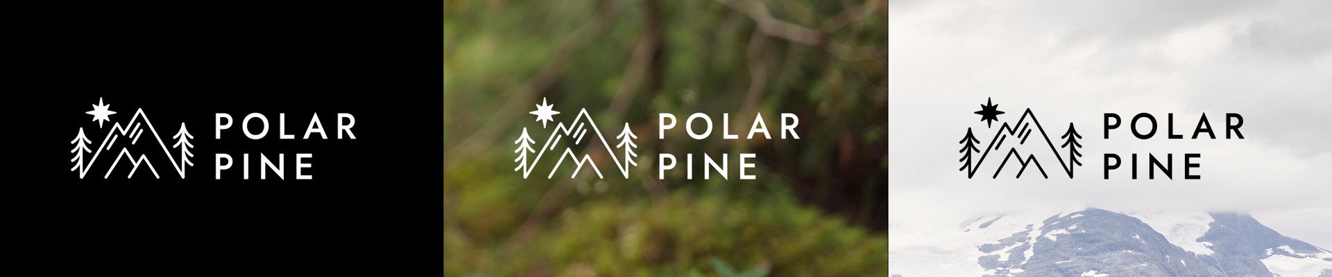
Note! Never place the logo on images or illustrations that are cluttered or have low contrast.
Round Symbol
Our round symbol is often featured on clothing and outdoor gear. It captures the essence of our brand in a compact design, making it ideal for limited spaces or standalone applications. This symbol is a versatile extension of our logo, recognized for its simplicity and strength.
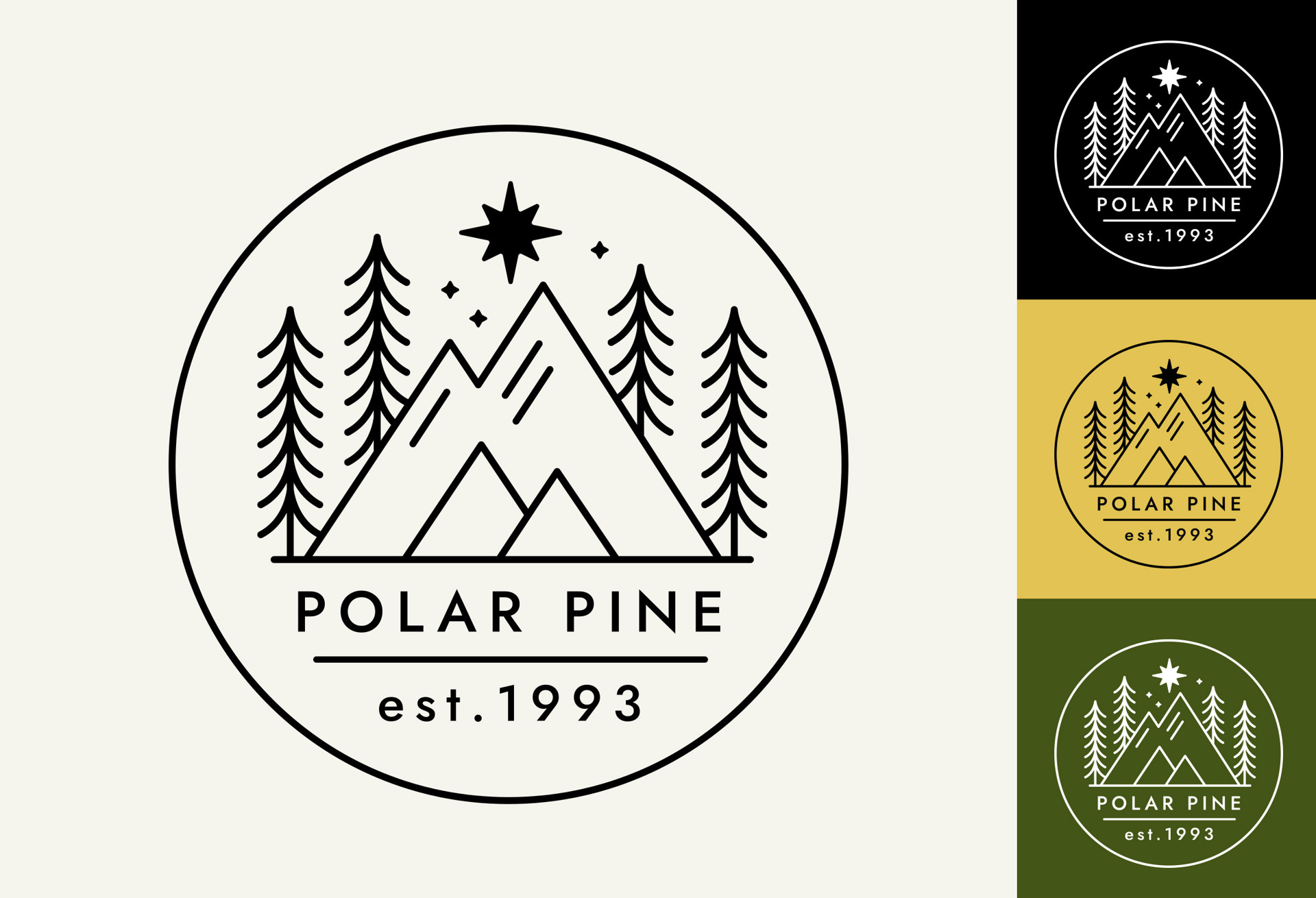
The patch
The patch version of our round logo is often used as an embroidered patch on clothing and gear. It delivers a rugged and durable representation of our brand, designed for outdoor wear. This version is ideal for application on jackets, backpacks, and other adventure-ready apparel.
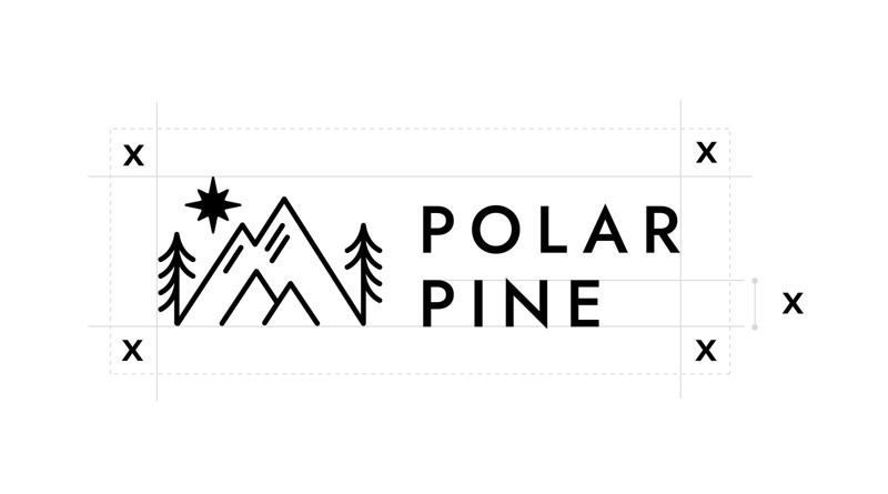
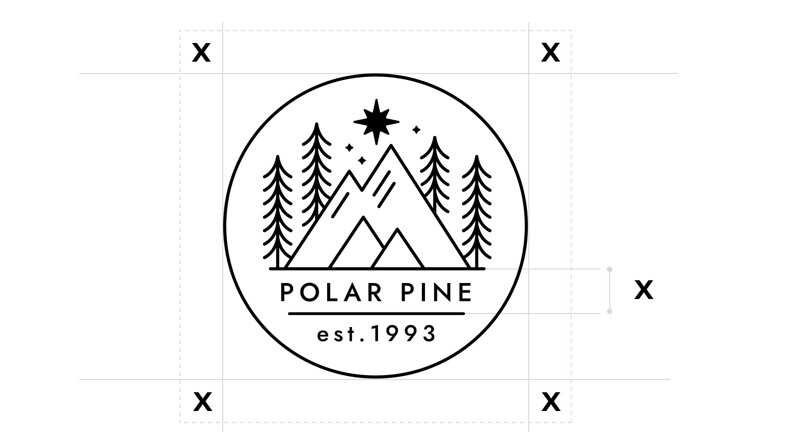
Positioning
When placing the logo, ensure it has enough space to breathe. Always maintain a clear area around the logo equivalent to the height of the "X" in the logotype, free from any text or graphics. This space ensures the logo remains clear and prominent in any context.
Downloads
Here you find all our logotypes as downloadable files.